Learn how to design effective empty states, loading screens, and error messages that improve usability, reduce user frustration, and create seamless digital experiences through better UI/UX design strategies.
Introduction
A great digital experience is not just about attractive layouts, beautiful colors, or modern animations. It is also about how a website or application communicates with users during different situations. Empty states, loading screens, and error messages are three important interface elements that significantly influence user experience.
Users frequently encounter these situations while browsing websites, using mobile applications, submitting forms, or accessing information. Poorly designed messages can create confusion, frustration, and even cause users to leave an application. On the other hand, thoughtfully designed interface states can guide users, build trust, and make digital products easier to navigate.
In this blog, we will explore practical ways to design better empty states, loading screens, and error messages for modern websites and applications.
1. Understanding Empty States in UI/UX Design
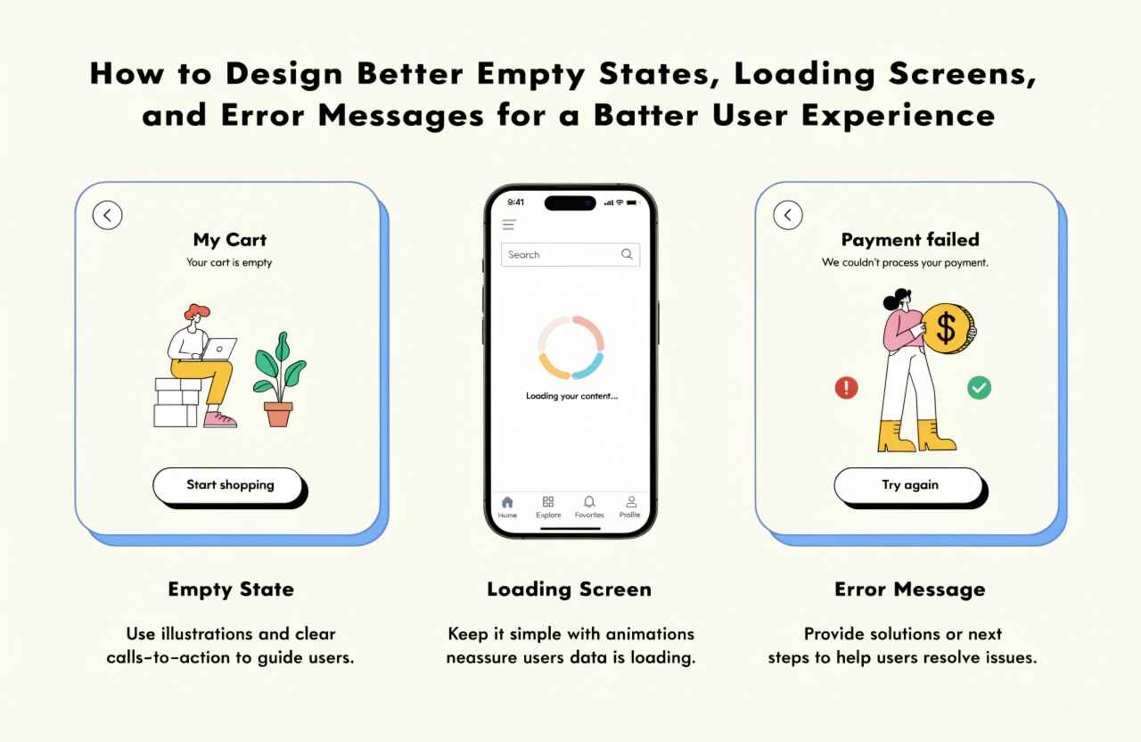
An empty state appears when a particular section of an application has no information to display. For example, a user may open their shopping cart before adding any products, visit a dashboard without available data, or check their notification section when there are no new notifications.
Instead of displaying a completely blank screen, designers should use empty states to explain the situation and guide users toward their next action.
Best Practices for Designing Empty States
1. Provide Clear and Friendly Messages
Use simple language to explain why the section is empty. For example, instead of displaying only "No Data Found," use "Your project list is empty. Create your first project to get started."
2. Include Relevant Visual Elements
Illustrations, icons, and subtle graphics can make empty screens more engaging. However, visuals should support the message rather than distract users.
3. Add Helpful Call-to-Action Buttons
Every empty state should guide users toward a useful action. Examples include:
- Add Your First Product
- Create a New Project
- Upload a Document
- Explore Available Features
4. Maintain Consistent Design
Empty states should follow the application's typography, colors, spacing, and overall visual identity.
2. Designing Better Loading Screens
Loading screens appear when an application needs time to process information, retrieve data, upload files, or complete an operation.
Without proper loading indicators, users may assume that the application is frozen or not responding. A well-designed loading experience communicates progress and reassures users that the system is working.
Best Practices for Loading Screen Design
1. Use Appropriate Loading Indicators
Different situations require different loading indicators. Consider using:
- Spinners for short loading operations.
- Skeleton screens for content-heavy pages.
- Progress bars for file uploads and downloads.
- Subtle animations for background processing.
2. Avoid Unnecessary Waiting
Optimize website performance and application response times wherever possible. Loading animations should never hide performance problems that could be solved through better development practices.
3. Provide Progress Information
When an operation takes longer, communicate what is happening. Messages such as "Uploading your file..." or "Preparing your dashboard..." help users understand the process.
4. Use Skeleton Screens for Better Perception
Skeleton screens display placeholder shapes that represent the expected content layout. They help users understand what will appear on the page and create a smoother transition when actual content loads.
3. Creating Helpful Error Messages
Error messages appear when something goes wrong during user interaction or system processing. Common examples include incorrect login credentials, invalid form information, payment failures, network problems, and unavailable services.
A poorly written error message can make users feel confused or helpless. Effective error messages should explain the problem and provide a clear solution.
Best Practices for Error Message Design
1. Use Simple and Understandable Language
Avoid technical terminology that ordinary users may not understand.
Instead of:
"Error 500: Internal Server Exception."
Use:
"Something went wrong on our end. Please try again in a few moments."
2. Explain How to Fix the Problem
Whenever possible, provide an actionable solution.
For example:
- Incorrect password: "Your password doesn't match. Please try again."
- Invalid email: "Enter a valid email address."
- Network issue: "You're currently offline. Check your internet connection and try again."
3. Highlight the Problem Clearly
Use appropriate colors, icons, borders, or inline messages to identify errors. Red is commonly used for error indicators, but never rely on color alone. Include descriptive text or icons for accessibility.
4. Preserve User Information
If a form submission fails, avoid clearing the information users have already entered. Preserving their input reduces frustration and makes recovery easier.
4. Maintain Consistency Across All Interface States
Empty states, loading screens, and error messages should feel like parts of the same product rather than separate design elements.
Maintain consistent typography, icon styles, button designs, colors, spacing, and messaging patterns. This creates a predictable experience and helps users understand how to interact with different sections of an application.
Designers should also consider accessibility by using readable font sizes, sufficient color contrast, descriptive messages, keyboard-friendly interactions, and screen-reader-compatible status updates.
5. Test Different User Scenarios
Designing these interface states is not complete without proper testing. UI/UX designers and developers should evaluate how the application behaves under different conditions.
Consider testing scenarios such as:
- First-time users accessing an empty dashboard.
- Users with slow or unstable internet connections.
- Failed form submissions.
- Interrupted file uploads.
- Empty search results.
- Server or API failures.
- Users accessing the application on smaller screens.
Testing these situations helps identify usability issues before the product reaches actual customers.
Conclusion
Empty states, loading screens, and error messages may appear to be small elements of interface design, but they play an important role in creating successful digital products.
A meaningful empty state encourages users to take action, an informative loading screen builds confidence, and a helpful error message makes problem-solving easier.
By focusing on clear communication, consistent visual design, accessibility, and user-centered interactions, businesses can create websites and mobile applications that deliver better user experiences.
At Daydreamsoft Infotech LLP, thoughtful UI/UX design and development practices help transform digital ideas into functional, engaging, and user-friendly experiences. Remember, great design is not only about what users see when everything works perfectly; it is also about how smoothly they navigate when something is missing, loading, or goes wrong.
We build scalable web, mobile, and game products for clients worldwide — combining modern frameworks, cloud infrastructure, and best engineering practices.