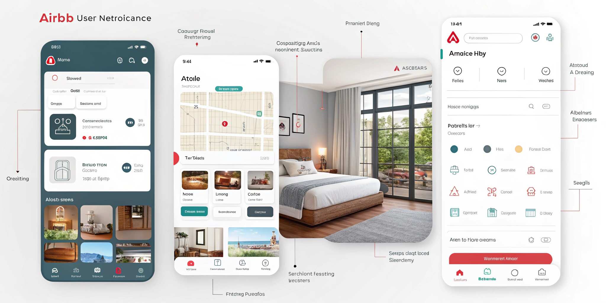
Airbnb has long been praised for its clean, intuitive, and engaging user interface (UI). Its most recent redesign reinforced its commitment to user-first digital experiences while introducing subtle yet impactful changes. For developers and designers, studying this redesign offers practical lessons in crafting effective and delightful interfaces.
1. Simplicity in Design
Airbnb stripped away unnecessary clutter, ensuring users focus on their primary goals: searching, booking, and experiencing stays. White space, minimal typography, and clear imagery create a distraction-free flow.
Lesson: Keep interfaces simple—less clutter, more clarity.
2. Consistent Visual Language
The redesign maintains brand consistency with a harmonious color palette, modern typography, and universally recognizable icons. These elements tie the digital experience directly to Airbnb’s identity.
Lesson: Consistency across UI elements builds trust and familiarity.
3. Stronger Visual Hierarchy
Key actions like “Search” and “Book” are emphasized through larger buttons, bolder text, and prominent placement. Content sections are clearly divided with spacing and typography.
Lesson: Guide users with visual hierarchy—make important actions impossible to miss.
4. Enhanced Imagery & Storytelling
High-resolution photography is central to Airbnb’s experience. The redesign highlights properties with immersive visuals, tapping into users’ emotions and aspirations.
Lesson: Use imagery strategically—it’s not just decoration but part of storytelling.
5. Accessibility and Inclusivity
Airbnb continues to improve accessibility by implementing proper color contrast, larger tap targets, and screen-reader-friendly structures. This ensures everyone can use the platform.
Lesson: Inclusive design isn’t optional—it’s essential for global products.
6. Seamless Cross-Device Experience
From desktop to mobile, Airbnb’s redesign is fluid and responsive. The booking journey remains intuitive no matter the device.
Lesson: Prioritize responsive design—users expect consistency across platforms.
7. Personalization at Scale
The redesign integrates personalization, surfacing suggestions based on user history and preferences. This creates a tailored, welcoming experience.
Lesson: Use data responsibly to enhance user journeys with personalization.
Conclusion:
Airbnb’s UI redesign shows that great design is about balance—simplicity, consistency, accessibility, and storytelling. Developers and designers can take these principles and apply them to any product, creating experiences that are both functional and delightful.