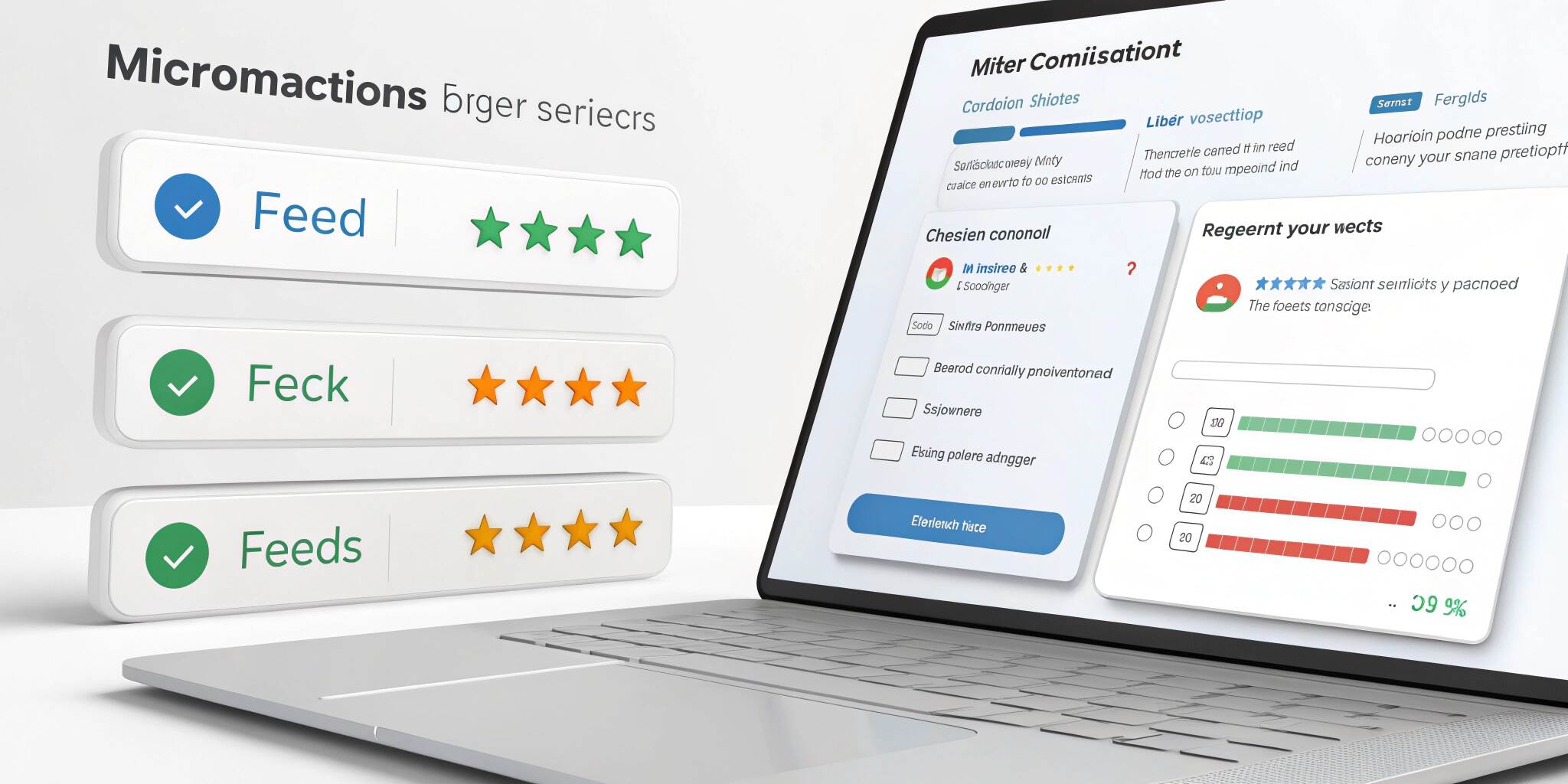
Ever noticed a heart icon gently filling with color when you “like” a post, or a subtle shake when you enter the wrong password? These are microinteractions—small design details that communicate status, provide feedback, and enhance usability. They may be tiny, but they have a huge impact on UX (User Experience).
What Are Microinteractions?
Microinteractions are small, contained product moments that accomplish a single task. They help guide the user, provide immediate feedback, and make interactions feel more human.
Common examples:
- A button changing color when hovered over.
- Progress indicators during file uploads.
- Password strength meters.
- “Typing…” indicators in chat apps.
Why Microinteractions Matter in UX
- User Guidance: Help users understand what’s happening.
- Feedback: Show results of user actions instantly.
- Engagement: Make the experience more enjoyable and memorable.
- Error Prevention: Alert users to mistakes before they proceed.
Four Key Components of Microinteractions
- Trigger: What starts the interaction (e.g., click, hover, voice command).
- Rules: The logic that determines what happens next.
- Feedback: Visual, audio, or haptic responses to user actions.
- Loops & Modes: How the interaction evolves over time (e.g., animations for repeated actions).
How to Implement Microinteractions in Web & App Design
1. Identify High-Impact Moments
Focus on areas where users need confirmation, feedback, or guidance—like form submissions, navigation, and content loading.
2. Keep It Subtle
Microinteractions should enhance, not distract. Avoid overly long animations or flashy effects.
3. Prioritize Usability Over Decoration
Every microinteraction should serve a functional purpose, not just look nice.
4. Use the Right Tools
- For Web: CSS animations, JavaScript, GSAP, Lottie.
- For Mobile Apps: SwiftUI (iOS), MotionLayout (Android), React Native Animated API.
5. Test Across Devices
Make sure animations run smoothly on both desktop and mobile without performance issues.
Examples of Microinteractions Done Right
- Twitter’s Heart Animation: Smooth color fill with a burst effect on like.
- Slack’s Message Status Indicators: Simple, clear, and intuitive.
- Google Docs Autosave Notification: Non-intrusive, reassuring feedback.
Best Practices Checklist
Keep animations under 400ms for speed.
Maintain consistency across the app/website.
Ensure accessibility—animations shouldn’t block essential content.
Offer reduced motion settings for sensitive users.
Conclusion
Microinteractions may be small, but they play a big role in making digital experiences smooth, intuitive, and engaging. By thoughtfully implementing them, you can improve usability, delight users, and create a product that feels polished and professional.