Modern CSS has transformed frontend layout design. Gone are the days of floats, table hacks, and brittle positioning tricks. Today, Flexbox and CSS Grid are the primary layout systems used to build responsive, flexible, and maintainable interfaces. While both are powerful, they solve different problems. Understanding when to use each is essential for clean and scalable frontend architecture.
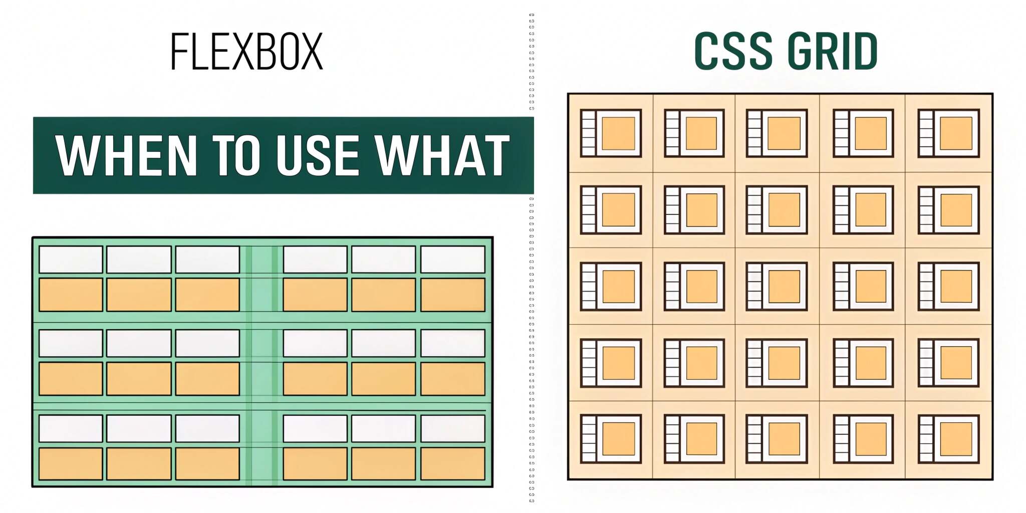
Understanding Flexbox: One-Dimensional Layouts
Flexbox is designed for one-dimensional layouts, meaning it controls layout along a single axis—either horizontal or vertical. It excels at distributing space within a container and aligning items dynamically.
Flexbox shines when:
- Elements need to be aligned in a row or column
- Content size is unpredictable
- Items need flexible spacing
- Order of elements may change
Common Flexbox use cases include navigation bars, toolbars, form controls, and card layouts with unknown content size.
Understanding CSS Grid: Two-Dimensional Layouts
CSS Grid is built for two-dimensional layouts, controlling both rows and columns simultaneously. It allows developers to define explicit grid structures and place elements precisely within them.
Grid is ideal when:
- Layout structure matters more than content flow
- You need consistent rows and columns
- Complex page layouts are required
- Overlapping elements or layered layouts are needed
CSS Grid is commonly used for page-level layouts, dashboards, and complex component grids.
Conceptual Difference: Content-First vs Layout-First
Flexbox is content-first. The size of items often determines how space is distributed. This makes it ideal for dynamic, component-level layouts.
CSS Grid is layout-first. You define the grid, and content adapts to it. This makes Grid excellent for defining the overall structure of a page or large sections.
Understanding this difference helps prevent misuse and overcomplication.
Alignment and Spacing
Both systems provide powerful alignment tools, but with different focuses.
Flexbox excels at:
- Centering items easily
- Distributing space along a single axis
- Aligning items with varying sizes
CSS Grid provides:
- Precise control over rows and columns
- Consistent spacing across both dimensions
- Alignment at the grid and item level
For simple alignment problems, Flexbox is often the faster and cleaner solution.
Responsiveness and Media Queries
Flexbox adapts naturally to content changes, making it suitable for responsive components. CSS Grid, on the other hand, offers advanced responsiveness through features like auto-fit, auto-fill, and minmax.
Grid allows layouts to adapt without heavy reliance on media queries, which can significantly simplify responsive design for complex layouts.
Performance and Maintainability
Both Flexbox and Grid are highly performant and well-supported in modern browsers. Performance differences are negligible for most use cases.
Maintainability is where the real difference lies. Misusing Grid for simple linear layouts or overusing Flexbox for complex page structures leads to confusing CSS and fragile designs.
Choosing the right tool results in clearer code and easier maintenance.
Combining Flexbox and CSS Grid
Flexbox and Grid are not competitors—they are complementary. Many of the best layouts use both:
- CSS Grid for overall page structure
- Flexbox for aligning content inside grid items
This layered approach provides maximum flexibility and clarity.
Common Mistakes to Avoid
- Using Grid for simple one-dimensional alignment
- Overusing Flexbox for complex page layouts
- Relying on hacks instead of native layout features
- Ignoring accessibility and reading order
Understanding layout intent prevents these mistakes.
Practical Guidelines
Use Flexbox when:
- Layout flows in one direction
- Content size is dynamic
- Alignment is the main concern
Use CSS Grid when:
- You need control over rows and columns
- Layout structure is complex
- Consistency across dimensions matters
Final Thoughts
Flexbox and CSS Grid are foundational tools for modern frontend engineering. Rather than choosing one universally, effective layout design comes from understanding their strengths and applying them intentionally. Using the right layout system leads to cleaner CSS, better responsiveness, and more scalable user interfaces.