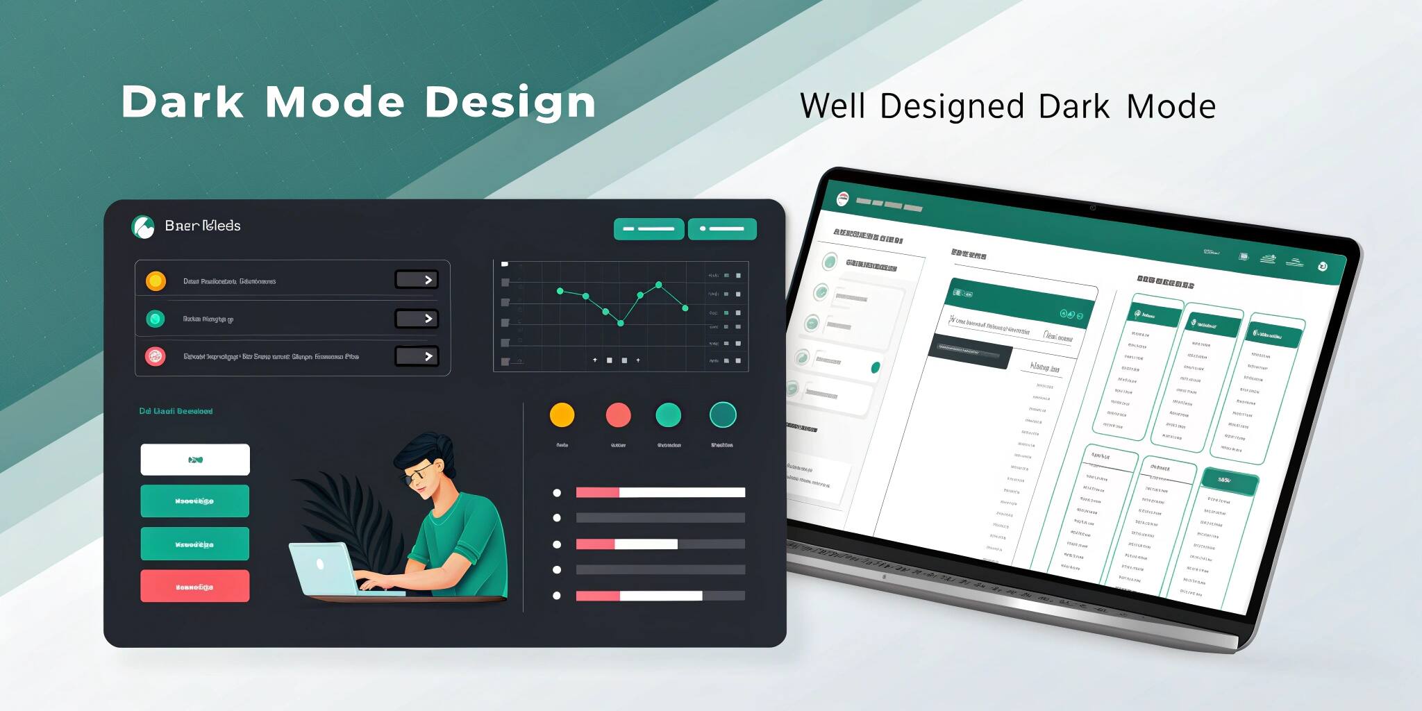
Introduction: Why Everyone Loves Dark Mode
Dark mode has become a default expectation in modern apps and websites. From reducing eye strain to offering sleek, battery-saving visuals, its appeal is undeniable. But effective dark mode design takes more than just flipping colors — it requires planning, testing, and user empathy.
Benefits of Dark Mode
- Comfortable Viewing: Especially in low-light environments
- Battery Savings: Particularly for OLED displays
- Modern Look & Feel: Appealing to tech-forward audiences
- Reduced Eye Strain: When implemented correctly
Best Practices for Dark Mode Design
1. Choose Softer Dark Shades
Pure black can feel harsh. Use dark grays or charcoal tones for a more comfortable, sophisticated look that’s easier on the eyes.
2. Maintain Strong Contrast
Text and UI elements must remain clearly visible. Avoid combinations like light gray text on dark gray backgrounds. Always prioritize legibility.
3. Avoid Pure White for Text
White text on dark backgrounds can cause glare and fatigue. Use slightly muted light colors to soften the contrast while preserving readability.
4. Adapt Brand Colors Thoughtfully
Your brand colors may not work well against dark backgrounds. Adjust brightness or saturation to ensure they remain effective and accessible.
5. Create Visual Hierarchy
In light interfaces, shadows help distinguish layers. In dark mode, use subtle borders, color variations, and spacing to show depth and focus areas.
6. Offer a Toggle Option
Let users choose between dark and light modes. Some prefer light mode during the day and dark mode at night. Respect user preferences for the best experience.
7. Test in Real Environments
Design in low-light settings to truly understand how your interface looks and feels. What works in a bright office might not work in a dark room.
Common Pitfalls to Avoid
Inverting Light Mode Designs
Dark mode isn’t just the reverse of light mode. Simply flipping colors can break contrast, ruin visual balance, and make text or UI elements unreadable.
Forgetting Visual Content
Images, illustrations, and icons often clash with dark backgrounds. Ensure these assets are optimized or adapted to suit both light and dark versions.
Neglecting Accessibility
Low contrast in dark mode can alienate users with vision impairments. Always follow accessibility standards and test with real users when possible.
One-Size-Fits-All Color Palettes
Don't use a single dark palette across all screens. Design specifically for dark mode to address the unique needs of each interface or feature.
Conclusion: Design with the User in Mind
Dark mode is more than a trend — it’s a feature that, when well-designed, enhances usability, accessibility, and satisfaction. Focus on clarity, consistency, and testing. A carefully crafted dark mode not only looks good but works better for your users.