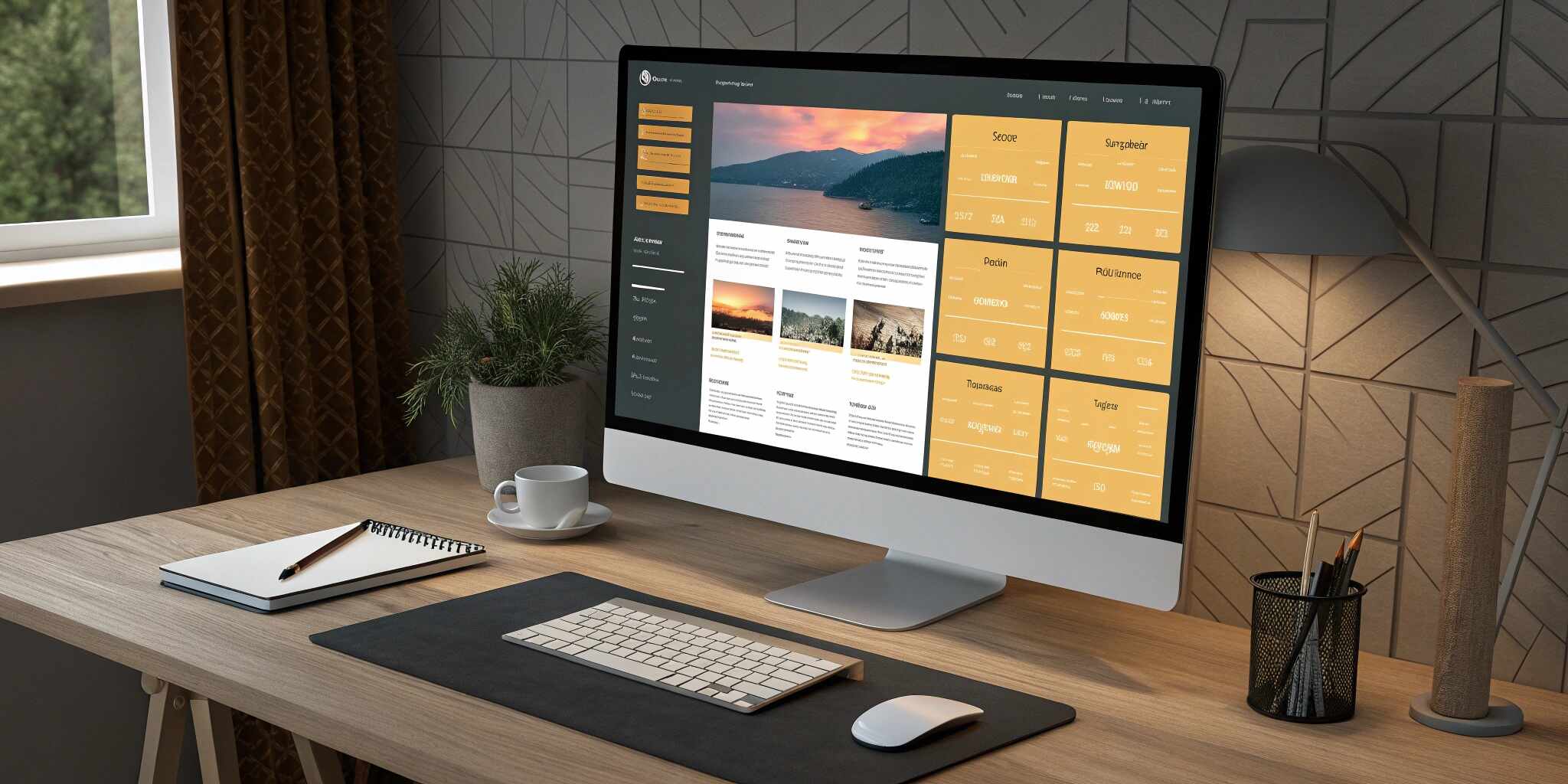
Responsive design has become a cornerstone of modern web development. Users access websites on devices of all shapes and sizes, making adaptable layouts a necessity. Fortunately, CSS Grid and Flexbox offer powerful tools to craft flexible and responsive designs.
Why Use CSS Grid and Flexbox Together?
CSS Grid and Flexbox are layout models designed to solve different problems:
- Flexbox is ideal for one-dimensional layouts—row or column.
- CSS Grid is perfect for two-dimensional layouts—rows and columns.
Using both together enables you to build robust, clean, and efficient interfaces that scale beautifully across screen sizes.
Best Practices
- Use Grid for page-level layout and Flexbox for component-level alignment.
- Test your layout across devices using responsive design tools in your browser.
- Use fr units and auto to allow your layout to scale intelligently.
- Combine minmax() and auto-fit in Grid for dynamic resizing.
Benefits of Mobile-First + Grid + Flexbox
- Better performance on mobile
- Cleaner code structure
- Easier scalability
- Fewer breakpoints needed
Conclusion
Combining CSS Grid and Flexbox allows for greater flexibility and responsiveness in your layout. With these two powerful tools, you can create modern designs that look great on any device—from large desktop screens to small smartphones.
Start small, experiment, and iterate. Responsive design isn’t just a trend—it’s a necessity.